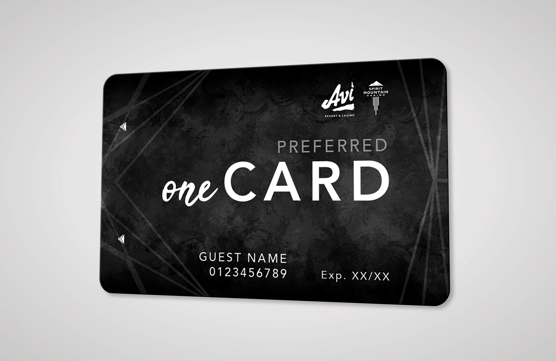
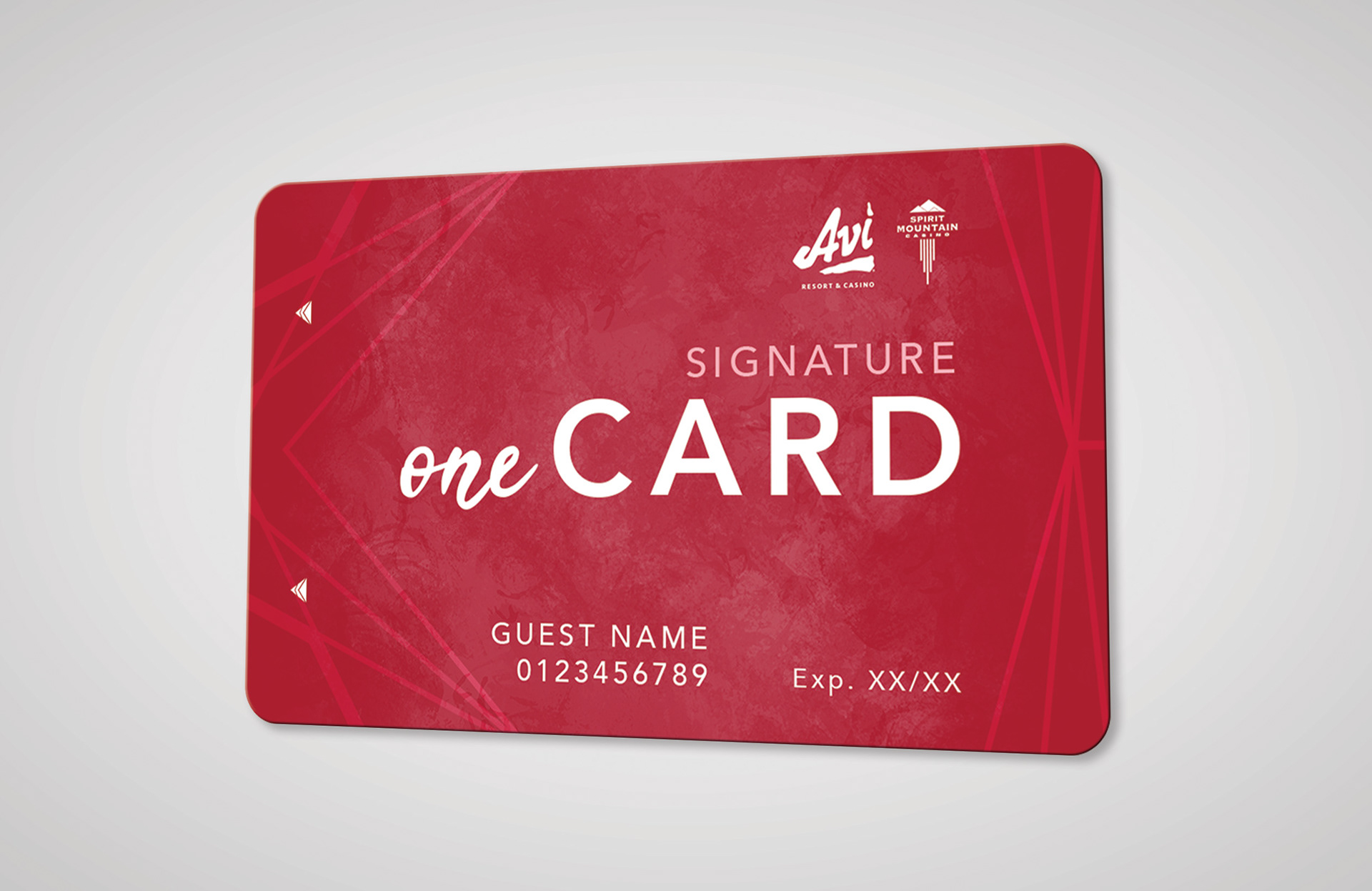
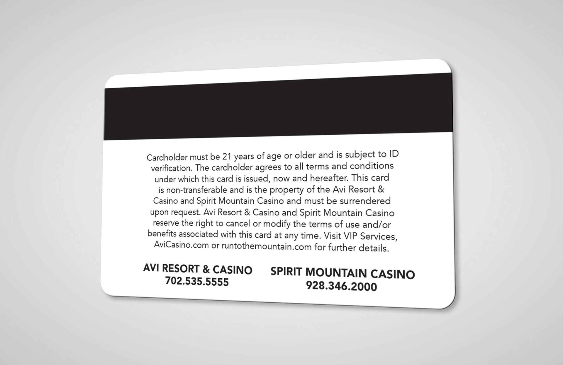
Below is the final concept I created as it is currently being used. The background utilizes colors from AVI's current palette, a luxurious texture, and an expanded logo element. For fonts, I paired a heavily tracked sans-serif from their current brand guidelines with a similar weight, easy-to-read script. These elements combined create an elevated and more on-brand version of their previous cards.
Role: Designer | Creative Director: Ryan Supalla |
Clients: Avi Resort & Casino & Spirit Mountain Casino | Agency: Red Circle Agency
Clients: Avi Resort & Casino & Spirit Mountain Casino | Agency: Red Circle Agency


PROCESS WORK
Previous "myAdvantage" player's card created by another designer.
ROUND 1 | Option A submitted to the client. This is what would eventually become the final.
ROUND 1 | Option B submitted to the client.
ROUND 2 | Option A submitted to the client. At this point, they also requested we change the name from myAdvantage to oneCard. This option would ultimately end up being chosen but the client requested the colors be switched.
ROUND 2 | Option B submitted to the client.
ROUND 2 | Option C submitted to the client.
ROUND 2 | Option D submitted to the client.
ROUND 2 | Option E submitted to the client.
